The standard SharePoint 2013 top navigation menu just wasn't blowing my hair back. There are some decent examples of how to style the top menu but nothing close to what I was looking to do. I wanted a Mega Menu type layout without heaps of flair which was simple to implement and easy for others to understand. After looking around at various options like CSS friendly control adapters, custom code and jQuery hacks, I was able to get pretty close with just pure CSS and some SharePoint 2013 Design Manager Top Menu configuration options. The result was a responsive CSS menu that is simple to manage.
My requirements were pretty easy; only CSS contained in a custom stylesheet, term store driven hierarchy and as little as possible complexity. The twist was to have 3 levels of hierarchy build out in the term store. I like the flexibility and it allowed me to build out the navigation with custom ordering, labels and groupings.
The implementation isn't as straight forward as creating a custom stylesheet and overriding the existing bloated SharePoint 2013 menu styles. However, it is (what I consider) super clean. Here's what you'll need:
- New master page or a copy of an existing
- Custom stylesheet referenced in your Master Page settings located in Site Settings
- Managed Meta Data Term Set for the Menu items
Crazy right? "But I'm already doing this", you say. I know, I know it gets more complicated…perhaps. It was for me at first because I hadn't used the Design Manager that new in SharePoint 2013. It's worth learning if you haven't taken the time yet. With Design Manager you can work with simple HTML templates and build master pages. Much quicker than dealing with the full blown SharePoint master pages and trying to figure out what needs to stay and what can go.
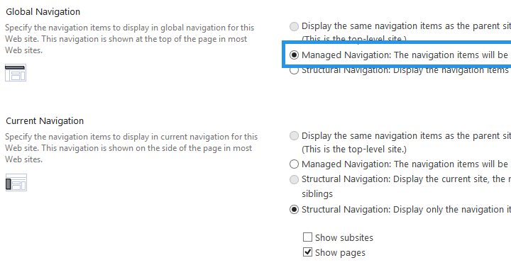

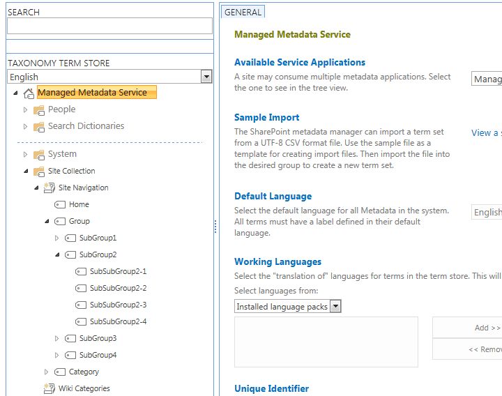
- Build out a navigation term set that will control your menu items. Site Settings –> Navigation. Make sure Managed Navigation is selected
- Download and rename the master page HTML template of your choice from Site Settings –> Master Pages. I used seattle.html and renamed it to super_simple.html.
- Upload it back to the Master Page Gallery, edit the properties and associate a file with it. That will create the associated super_simple.master file.
-
In Design Manager click Top Navigation and change the following configuration options on the right side:
- CssClass: nav
- MaximumDynamicDispalyLevels: 0
- StaticDisplayLevels: 4
Create a new HTML master page
Site Settings –> Master pages and page layouts
Download a copy of seattle.html
Rename to simple.html and upload into Master Page Gallery
Publish a Major Version so that it shows up Site Settings –> Master Page
Specify the new master page called 'simple' and hit OK
Open up Design Manager under Look and Feel and click Edit Master Pages and click 'simple'
Click Snippets in upper right corner
Click Top Navigation under Design tab
Under Customization – Top Navigation ( AjaxDelta ) define a CssClass of your choosing. I used 'topNav'.
Under Customization – Top Navigation ( AspMenu ) change StaticDisplayLevels to fit your hierarchy. I used 4.
Click Update at the bottom
You will now need to copy the new HTML Snippet to use in your HTML Master Page. Click Copy to Clipboard.
Edit the simple.html file you downloaded earlier and find the AspMenu control (around line 218).
Paste the new snippet above then remove the old and save. Upload to the Master Page Gallery and overwrite the old one.
You may need to remove some residual code like duplicated content placeholders, etc. but the errors are easy to read.
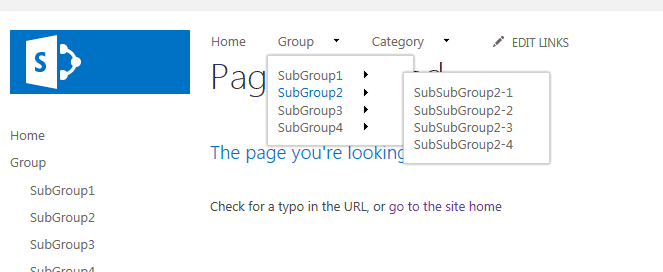
If you are successfull you can browse to the home and will see your links across the top.
Open SharePoint Designer and create a new stylesheet in the style library. I called my custom.css.
Add the following style and publish a Major Version:
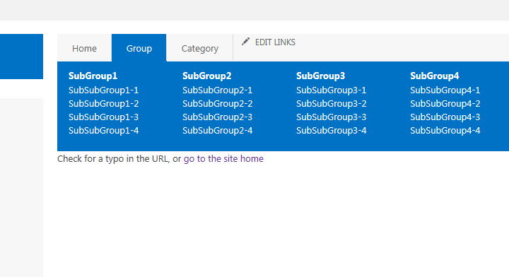
/* ————— MEGA MENU ————— */
/* reset all ULs in top nav */
.nav ul {
padding: 0;
margin: 0;
}
.nav div, ul.root {
position: relative;
width: 100%;
background: #f7f7f7;
}
/* hide all levels */
.nav ul > li > ul {
display: none;
}
/* target top level – selector + psuedo */
.nav ul.root > li:hover > ul {
display: block;
position: absolute;
left: 0;
width: 100%;
z-index: 999;
background: #0072c6;
padding:10px 0 20px 0;
}
.nav ul > li > ul > li > ul {
display: block;
position: relative;
}
.nav ul li li {
float: left;
margin: 0 15px;
}
.nav ul li li li {
clear: both;
padding: 0;
margin: 0;
}
/* link styles */
/* top level */
.nav ul.root > li > a {
padding: 10px 20px;
/* override core styles */
margin-right: 0 !important;
border-right: 1px #ddd solid !important;
}
/* first level hover */
.nav ul.root > li:hover {
background: #0072c6;
}
.nav ul.root > li:hover > a > span {
color:#fff;
}
/* every span past first level */
.nav ul.root > li > ul li span {
color: #fff;
}
.nav ul.root > li > ul li span:hover {
color: #ddd;
}
/* second level */
.nav ul.root > li > ul > li > a > span {
font-weight: 900;
}
Set the Alternate CSS URl under Site Settings –> Master Page –> Alternate CSS URL to your custom.css file.
Hit OK and tada!
Could you provide us with a more detailed description of this process? We've tried it multiple times, but have been unsuccessful. Where exactly do we place the snippet? What do we need to delete to make it work?
Work perfectly. Many thanks !
Hi, Can you please upload your masterpage too? Tried the abvove steps but the navigation did not change. Posting the finalized master page would help alot. Thanks!
The nav looks nice however it is definitely NOT responsive in any browser. Any ideas why this is?